How to build a KPI dashboard your team actually uses
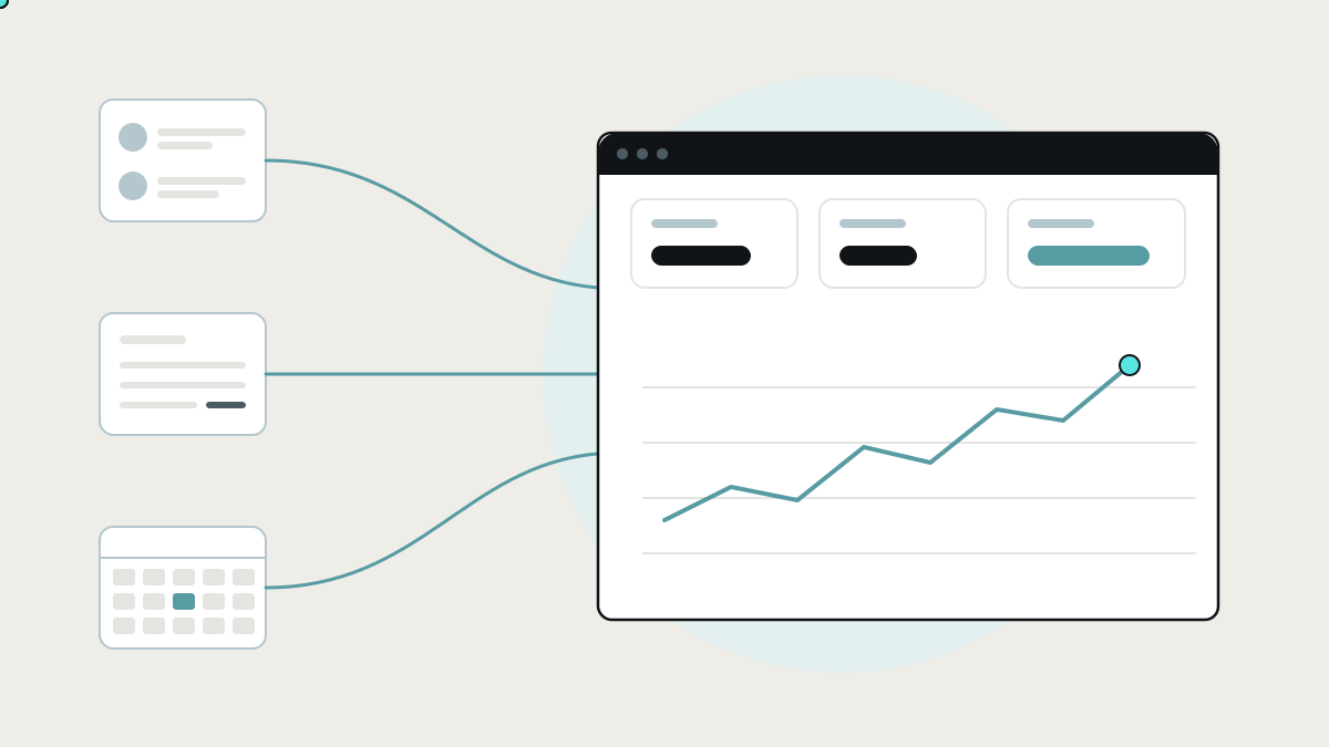
Most KPI dashboards fail because the numbers arrive late, disagree with the accounts, or measure things nobody acts on. How to choose KPIs, how Power BI, Data Studio and Metabase compare, and why the data layer matters most.
A KPI dashboard is a single screen that shows the handful of numbers that tell you whether the business is on track, such as sales booked, jobs completed, cash collected or orders late, and updates them without anyone rebuilding a spreadsheet. Most businesses have tried to build one. Many end up with a dashboard nobody opens, because the numbers arrive late, disagree with the accounts, or measure things nobody acts on.
This guide covers how to choose KPIs that drive action, the tools that build dashboards and how each works, and why the hard part is rarely the chart. It's getting trustworthy numbers out of the tools you already use.
What makes a KPI dashboard useful
A useful dashboard passes four tests:
- Someone acts on it. Every number has an owner who changes what they do when it moves.
- It's current. The numbers update on their own, at the speed the decisions are made: daily for operations, weekly or monthly for finance.
- It's trusted. "Revenue" on the dashboard matches "revenue" in the accounts, because both use the same definition.
- It's short. Five to ten numbers per audience, not fifty. A dashboard that shows everything highlights nothing.
What the research says about measuring the right things
- Balance leading and lagging measures. Kaplan and Norton's Balanced Scorecard, first published in Harvard Business Review in 1992, came from a yearlong study of 12 companies. Their point was that financial results tell you about actions already taken, so they should sit next to operational measures: customers, internal processes, and the organisation's ability to learn and improve. (Harvard Business Review)
- Teams lose time to finding information. Asana's Anatomy of Work Index found that about 60% of working time goes on "work about work", including searching for information and chasing the status of work. A dashboard that answers "where are we?" without asking anyone attacks exactly that. (Asana)
- Disconnected data is the norm, not the exception. MuleSoft's 2025 Connectivity Benchmark, a survey of over 1,050 IT leaders, found that only 29% of a typical enterprise's applications are integrated, and 90% of organisations report obstacles caused by data silos. (Salesforce / MuleSoft) A dashboard is only as complete as the data that reaches it.
How to choose your KPIs
Start from decisions, not data. For each team, ask: "What would make you change what you do this week?"
- Sales: new enquiries, quotes sent, quote-to-win rate, pipeline value by stage.
- Operations: jobs or orders open, late, and completed; average time from order to delivery; first-time fix rate.
- Finance: cash in the bank, invoices overdue, days to get paid, gross margin by service or product.
- Customers: repeat rate, complaints or refunds, response time.
- People: utilisation, overtime, open shifts, staff turnover.
Then pair each lagging number (revenue, margin) with a leading one you can act on sooner (quotes sent, jobs booked for next week). That pairing is the core of the Balanced Scorecard idea, and it's what turns a report into a steering tool.
Write a one-line definition for every KPI ("revenue = invoices issued, excluding VAT, by invoice date"), and agree who owns it. Most dashboard arguments are really definition arguments.
The tools that build KPI dashboards
Built-in reports in your existing tools
How they work: HubSpot, Xero, QuickBooks, Shopify and most other business software come with their own reports and dashboards.
Where they shine: they're free with the product, accurate for that product's data, and need no setup.
Where they stop: each one only sees its own data. "Margin per job" needs the job from your scheduling tool, the hours from timesheets and the invoice from accounting. No single built-in report can see all three.
Spreadsheet dashboards: Excel and Google Sheets
How they work: someone exports data from each tool, pastes it into a sheet, and charts it.
Where they shine: flexible, familiar and quick to start.
Where they stop: it's manual, so it's late and depends on one person. Copy-paste errors creep in, and as the spreadsheet grows, nobody is sure which version is right.
Business intelligence tools: Data Studio, Power BI, Tableau and Metabase
How they work: you connect the tool to your data sources, model how the data relates, and build interactive charts and dashboards that refresh on a schedule.
- Google Data Studio (called Looker Studio from 2022 until Google changed the name back in 2026) is Google's free reporting tool. It connects natively to Google products like Google Analytics, Google Ads and BigQuery, and to many other sources through partner connectors. (Wikipedia)
- Microsoft Power BI pairs Power BI Desktop, where you model data and design reports, with the Power BI service, where you share, schedule refreshes and set alerts. Microsoft lists more than 100 data sources. (Microsoft Learn)
- Tableau is a long-established analytics tool known for visual exploration, owned by Salesforce.
- Metabase is open source. You connect a database, team members ask questions without writing SQL, and you can self-host it. (Metabase)
Where they shine: powerful charts, filtering and drill-down once the data is in good shape.
Where they stop: they assume clean, connected data. Connectors pull raw tables from each tool, but someone still has to join a CRM deal to an accounting invoice to a job, decide which "customer" record is the real one, and keep that logic working when a tool changes. That modelling work is where most BI projects stall in small businesses.
KPI dashboard services: Databox, Geckoboard and similar
How they work: hosted services with ready-made connectors to popular apps, designed to put a few headline numbers on a screen or TV quickly.
Where they shine: fast setup for standard metrics from popular tools.
Where they stop: they show what each connector provides. Metrics that depend on your own process, like margin per job, utilisation by site, or the time from quote to first visit, usually need data the connectors don't join up.
Why most dashboards fail: the data layer
Picture the Monday meeting. Sales says the month is strong, based on the CRM. Finance says it's soft, based on invoices. Operations says half the work is stuck waiting for parts, which lives in a spreadsheet. All three are right about their own tool. Nobody has a single version of the truth, because nothing joins the tools up.
Buying a better chart tool doesn't fix that. The fix is a data layer underneath it:
- Pull data from every tool automatically: CRM, accounting, scheduling, timesheets, the shop, the helpdesk.
- Match the records: the same customer, job or order across systems, linked by a shared ID rather than a name typed slightly differently.
- Apply your definitions once: revenue, margin, late and utilisation calculated the same way everywhere.
- Keep it current and checked: refresh on a schedule, alert someone if a source stops updating, and flag numbers that look wrong.
Once that layer exists, the dashboard is the easy part. You can show it in Power BI or Data Studio if your team already uses them, or in a simple custom screen.
What a connected dashboard looks like
When the data layer is in place, a dashboard can do more than report:
- Numbers you can click into. "12 jobs late" opens the list of those 12 jobs, with who owns each.
- Alerts instead of checking. The operations manager gets a message when late jobs pass a threshold, rather than having to look.
- Actions next to numbers. Chase an overdue invoice or reassign a job from the same screen, with the change written back to the tool it belongs in.
- One version of each number across sales, finance and operations, because they all come from the same definitions.
Your CRM, accounting package and scheduling tool stay exactly as they are. The dashboard sits on top and joins them up.
How to decide what you need
- Your numbers live in one tool: use that tool's built-in reports.
- Mostly Google or Microsoft data, with someone who enjoys building reports: Data Studio or Power BI.
- A database and a technical team: Metabase or another BI tool on top of it.
- Standard metrics from popular apps, for a wall screen: a KPI dashboard service.
- Numbers that depend on joining several tools, or on your own definitions: build the data layer first, then put whichever dashboard you like on top.
Before you build: a one-page KPI plan
- List the decisions each team makes weekly.
- Pick one to three KPIs per decision, pairing leading and lagging measures.
- Write the definition of each, in one sentence.
- Name the owner, and what they'll do when it moves.
- Note where the data lives today, tool by tool, and how it gets there.
- Mark the joins: every KPI that needs data from more than one tool. Those are the ones a plain BI tool will struggle with.
How we build dashboards at Lephlo
Reporting and dashboards are part of the internal tools and integrations we build for growing businesses. We start with the decisions, not the charts. We connect the tools you already use, match the records across them, apply your definitions in one place, and give you a dashboard your team will actually open. If you already use Power BI or Data Studio, we feed it clean data rather than replacing it.
It starts with a free consultation. We scope the first version around the few numbers that matter most, give you a fixed price, and build it in short steps you can see. You own the code and the data, fixes are free during the fix period after launch, and we stay on hand as it grows.
Related reading: internal tools: the apps you already use, and how to connect them. To size a first version, try the Build Scope Planner, or book a free consultation.
Frequently asked questions
What is the difference between a KPI and a metric? A metric is any number you can measure. A KPI is one of the few metrics you've chosen because it shows whether you're achieving a goal, and someone acts when it moves.
How many KPIs should a dashboard have? For one audience, five to ten. Leadership might watch a different set from operations, so build a view per audience rather than one crowded screen.
Is Power BI or Data Studio better for a small business? If your data is mostly in Google products, Data Studio is a natural fit. If you run on Microsoft 365, Power BI is. Either way, the quality of the dashboard depends on the data you feed it.
How often should a KPI dashboard update? As often as the decisions it supports. Operations often need hourly or daily numbers, while finance and leadership usually work weekly or monthly.
Can a dashboard pull from our CRM, accounting and spreadsheets at the same time? Yes, if there's a data layer that pulls from each, matches the records and applies your definitions. Without that, you get several dashboards that each tell part of the story.
Sources
- Robert S. Kaplan and David P. Norton, The Balanced Scorecard: Measures that Drive Performance, Harvard Business Review (1992)
- Asana, Anatomy of Work Index: Why work about work is bad
- MuleSoft, 2025 Connectivity Benchmark Report
- Product documentation: Microsoft Power BI, Metabase, Data Studio